Producing Bar Graphs: Poverty Statistics
This chart is the embodiment of millions of people living in poverty globally. We will be using these statistics to create our bar graphs and double bar graphs.
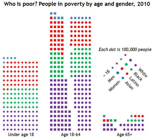
Let us first look at people living in poverty under the age of 18. There will be a few calculations to make before we can create our bar graph.
First: We will use the legend (each diamond is 100 000 people) to find out how many people under the age of 18 (sorted by race) are living in poverty.
There are 5 blue diamonds, which represent Asians. Therefore:
5 x 100 000 = 500 000
There are 61 red diamonds, which represent Latinos. Therefore:
61 x 100 000 = 6 100 000
There are 48 green diamonds, which represent people of color (or Blacks). Therefore:
48 x 100 000 = 4 800 000
There are 50 purple diamonds, which represent Caucasians or Whites. Therefore:
50 x 100 000 = 5 000 000
Let us add these numbers to find out how many people, world wide, under the age of 18 are living in poverty.
6 100 000
4 800 000
5 000 000
+ 500 000
___________
16 400 000 people living in poverty, world wide, under the age of 18.
Second: We will organize our bar graph. Therefore, we will:
(a) Give our graph a title: People Living in Poverty World Wide, <18
(b) Name our x-axis: Race
(c) Name our y-axis: Number of People Living in Poverty
(d) Complete the chart:
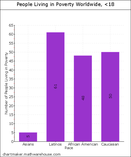
Note: The number of people living in poverty are represented by thousands.
Double Bar Graph
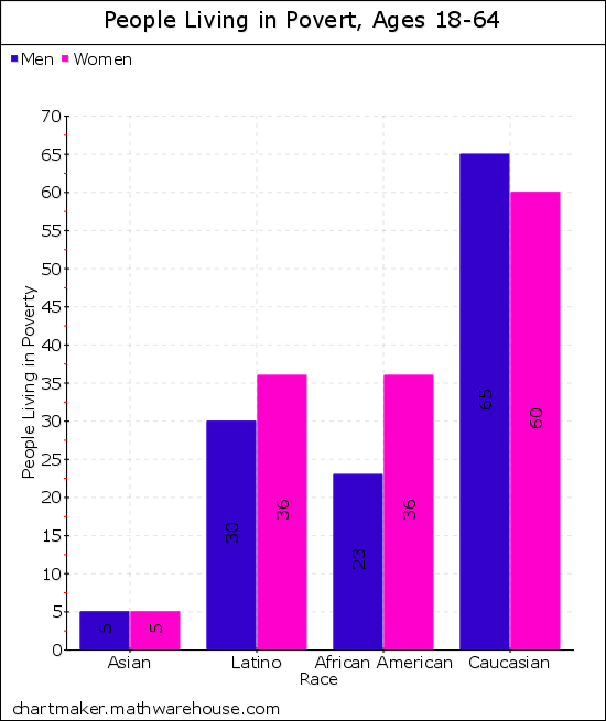
Now that we have created our first bar graph, let us create a double bar graph comparing men and women living in poverty between the ages of 18 and 64. One of the bars will represent the men, the other will represent the women. Let us first complete the calculations necessary:
Calculations: The squares represent the MEN and the circles represent the WOMEN. One (1) square represents 100 000 men and one (1) circle represents 100 000 women.
The color blue represents Asians living in poverty. There are 5 blue squares and 5 blue circles. Therefore:
Squares: 5 x 100 000 = 500 000 Asian men living in poverty
Circles: 5 x 100 000 = 500 000 Asian women living in poverty.
The color red represents Latinos living in poverty. There are 30 red squares and 36 red circles. Therefore:
Squares: 30 x 100 000 = 3 000 000 Latinos living in poverty.
Circles: 36 x 100 000 = 3 600 000 Latinas living in poverty.
The color green represents African Americans or Blacks. There are 23 green squares and 36 green circles. Therefore:
Squares: 23 x 100 000 = 2 300 000 Black males living in poverty.
Circles: 36 x 100 000 = 3 600 000 Black females living in poverty.
The color purple represents Caucasians or Whites. There are 65 purple squares and 60 purple circles. Therefore:
Squares: 65 x 100 000 = 6 500 000 Caucasian males living in poverty.
Circles: 60 x 100 000 = 6 000 000 Caucasian females living in poverty.