Introductory Graphing: Bar Graphs
Bar graphs:
Here is an example of a bar graph.
- Bar graphs are used to present and compare data.
- There are two main types of bar graphs: horizontal and vertical (we will focus on Vertical). They consist of rectangular bars that vary in height or length according to their value or frequency.
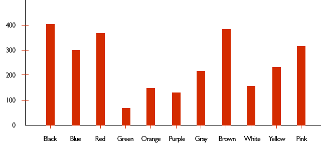
This is a Vertical bar graph.
- A Vertical bar graph consists of an x-axis, and y-axis.
- The numbers on the axes are known as the scales. Each bar represents a numeric or categorical variable.
- In the example above, the x-axis records the colors preferred, where as the y-axis represents the amount of people recorded that like said colors.
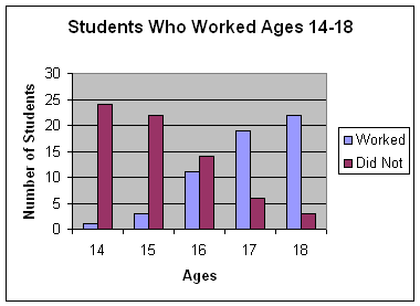
- Every bar graph should have a:
- Title (Students Who Worked Ages 14-18)
- Labelled x-axis (Ages) and y-axis (Number of Students)
- Neat and proportional columns
- Clearly identified structure (x-axis: 14, 15, 16 etc.. & y-axis: 0, 5, 10 etc.)
Group/double Bar Graphs:
- Double and group bar graphs are used to compare data about the same location or things.
- These graphs make it possible to compare several things at once but can be confusing if too much data is involved.
Here is a quick and accurate animated video on how to make a double bar graph.
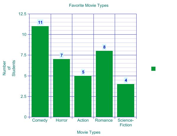
Activity: Favorite Movie Types
Imagine yourself in a classroom of 35 students. You are to ask your classmates about their favorite movie types- in other words, you are to collect data.
Here is the information you have collected:
11 students prefer comedy.
7 students prefer horror.
5 students prefer action.
8 students prefer romance.
4 students prefer science-fiction.
In order to create our first bar graph, we will follow a few steps.
STEP 1: We must give a title to our graph - let us call it "Favorite Movie Types".
STEP 2: We must clearly title the x-axis and y-axis. Our x-axis will be "Movie Types" and our y-axis will be "Number of Students".
STEP 3: We must clearly label the x and y-axis according to the data collected.
STEP 4: We must neatly enter the data.
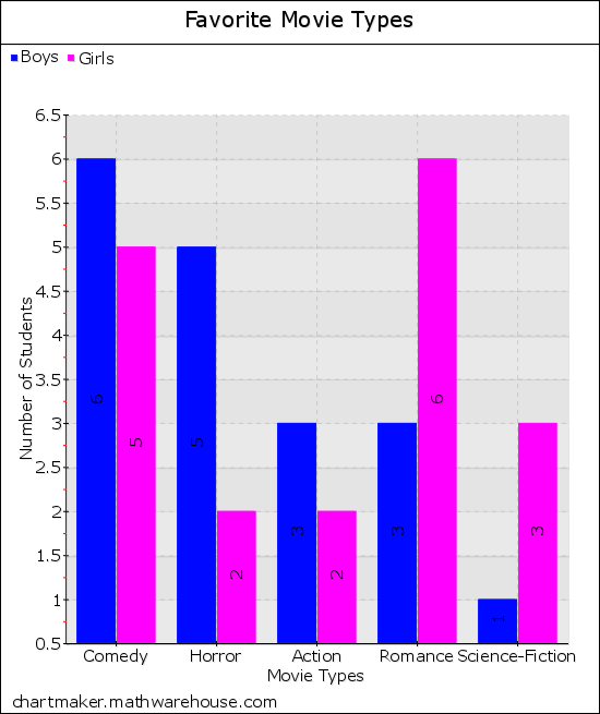
Now let us use the data we collected to construct a Double Bar Graph depicting boy and girl preferences.
Here is the information you had collected:
11 students prefer comedy (6 boys and 5 girls)
7 students prefer horror (5 boys and 2 girls)
5 students prefer action (3 boys and 2 girls)
8 students prefer romance (3 boys and 6 girls)
4 students prefer science-fiction. (1 boy and 3 girls)
We will use the same steps as we previously did, although we must make sure to clearly identify the column representing the boys' preferences and the column depicting the girls' preferences.